A personal parkrun analysis centred on the standout mid-2021 run of improving performances, placed in the context of the full results distribution. Let's look at what happened, and what a few visualisations can make obvious that a personal best on its own never could.
The mid-2021 breakthrough stands out not as one lucky fast run, but as a concentrated sequence of improving performances within a much longer and more variable record — a stretch that isn't repeated even as the underlying fitness numbers, on paper, get better.
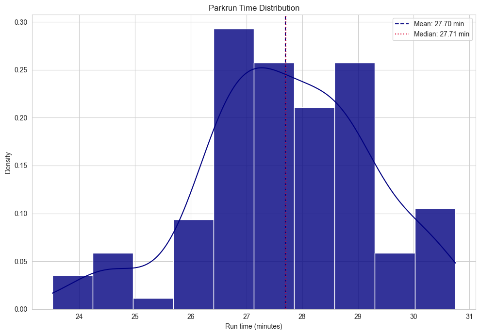
The distribution tells the honest story
Most results sit in a relatively tight middle band, with a smaller number of slower days and a distinct fast tail. That's more useful than looking only at a personal best. It shows the performance range that was actually repeatable, the normal variation around it, and the exceptional runs that sit outside the usual pattern. A histogram is a small act of honesty — it gives every Saturday a place in the story, not only the fastest one.
Mid-2021 was not one great run
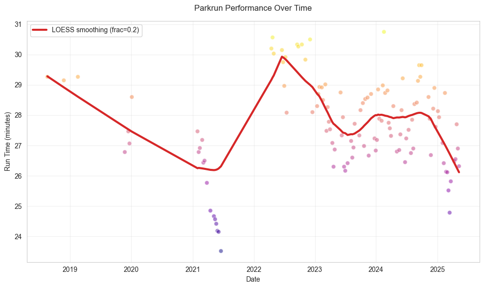
The key feature is the sequence, not the peak. The runs don't simply dip once; they step down over successive weeks into the low-24-minute range, with the fastest result of the entire record arriving in that same window. On the chart it looks like a brief performance runway: preparation, then a series of increasingly confident outcomes. The data can't say exactly why it happened — no training load, sleep, weather or course-condition detail is in it — but it can show this was more than a random isolated result. It was an unusually concentrated period of improvement.
There's a seasonal thread running underneath it, too. Averaged by month, May comes out as the fastest month in the record at roughly 25.8 minutes, against September as the slowest at roughly 29.2 minutes — a swing of nearly three and a half minutes between the best and worst months. The 2021 breakthrough lands right after that seasonal low point, which suggests favourable conditions compounded whatever training consistency was already building, rather than the breakthrough happening in spite of the calendar.
Age grade confirms the wider picture
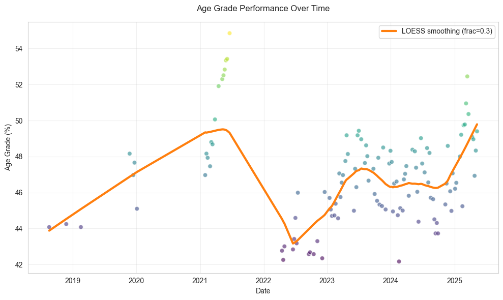
The age-grade chart matters because it asks a different question from raw time — it doesn't replace the clock, it adds context. Here it reinforces the central story: the mid-2021 run wasn't only fast in absolute terms, it was also strong relative to the performance benchmark the measure is built on.
What the forecast says about going back
Run the record forward — an ARIMA model fitted to the full time series, checked against a 5,000-run Monte Carlo simulation over a 26-week horizon — and the honest answer is: not soon. The simulation puts the odds of running another sub-25-minute parkrun at just 14%, with the single best forecasted time sitting around 26:38 — over two and a half minutes slower than the 23:31 personal best set in that mid-2021 window. That's not a discouraging result so much as a confirming one. It's quantitative evidence for exactly what the distribution already implied: 2021 was a genuine outlier peak, not a new baseline the runner simply hasn't returned to yet.
What the record is really about
The best interpretation isn't that improvement should always be linear. It's that patient consistency can create the conditions for a breakthrough, and that a breakthrough, once it happens, doesn't reset the baseline — the forecast says as much directly. Most weeks contribute quietly; a few weeks reveal the accumulated result, and the record afterwards shows variation, recovery and return rather than a failed attempt to recreate one peak.
Method
Combines four exploratory analyses of one runner's parkrun record: run-time distribution, seasonal and time-series trends, ARIMA/Monte Carlo forecasting, and age-grade context. A personal descriptive analysis, not training, performance or medical advice.