Australia's electricity transition has two dimensions, and only one of them usually makes the news. The national number — renewable generation rising, fossil share falling — is the version everyone quotes. The other dimension is geographical: specific projects, in specific places, connected to specific substations, shaped by local resource quality, land availability, community support and however much spare transmission capacity happens to exist nearby. A national trend can tell you the transition is happening. It can't tell you where — and where turns out to matter more than the headline number suggests.
The national picture is changing
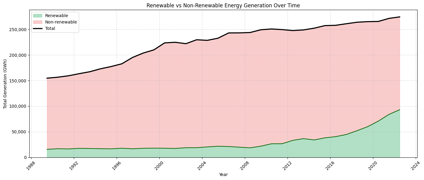
The long-run generation series makes the direction of travel unmistakable: total electricity generation has grown over time, and renewable output has accelerated hardest in the most recent years. But the remaining task was never simply "add more renewable megawatt-hours." It's integrating them into a system that still has to meet demand every hour, every season, in every region — and that's a physical build-out problem as much as a policy one.
The chart is deliberately zoomed out. It frames the transition as a system-wide shift rather than a scoreboard of individual projects. Zoom back in, though, and the picture gets a lot more uneven.
A transition that leans heavily on one state
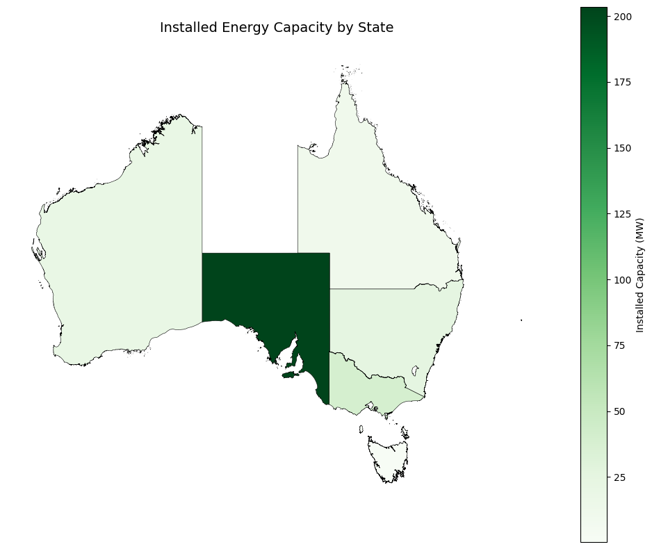
Here's how uneven: in the recent-accreditation data behind this map, South Australia alone accounts for roughly 203 MW of new capacity — against Victoria's 40, NSW's 25, WA's 20, Queensland's 11, and Tasmania's essentially rounding-error 0.3 MW. That's not a gentle skew. South Australia is carrying something close to two-thirds of the entire recent build-out on its own.
Wind and solar resources vary by region, and so do grid connections, planning settings and proximity to demand centres — but a two-thirds concentration in one state is a bigger signal than "geography matters" implies. It suggests the next phase of the transition is being decided by whichever states get the planning, connection and investment settings right first, not by the country as a whole moving in step.
Capacity is not the same as energy
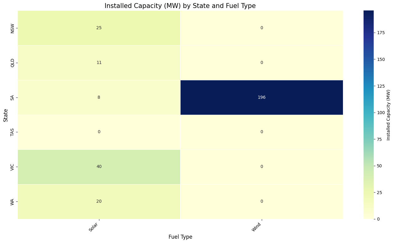
There's a second detail in this dataset worth sitting with: every single accredited facility in the recent-build sample is either solar or wind. Not one entry for gas, hydro, battery storage or anything else. That's a narrower pipeline than "renewables are diversifying" suggests — right now, at the facility level, the build-out is a two-technology story.
That matters because a megawatt of solar and a megawatt of wind don't behave the same way on the grid. They generate at different times, need different transmission planning, and say nothing on their own about whether storage exists to shift supply into the evening peak when people actually need it. Capacity is a useful map. It isn't a complete answer.
The decision is now spatial
Australia has moved past the abstract question of whether renewables can supply meaningful volumes of electricity — the evidence says they already can. The sharper question is whether projects, transmission and storage are being coordinated fast enough, in the right places, to turn a South-Australia-and-wind-and-solar build-out into a genuinely national, genuinely diversified system.
That's why maps belong in this conversation. They make visible what a national trend line hides: where projects cluster, where capacity is scarce, and where the next transmission investment would unlock the most value from generation that's already being built.
Method
Combines a long-run national generation series with a facility-level solar and wind dataset. The facility data is a recent-accreditation snapshot, not a complete generator register — useful for spatial and technology-mix patterns, not for total national capacity claims.