Welcome to my series on the world of data.
Here, I’ll tell a novel short story of something about our world and hope to shed a little bit of understanding in our lives.
I’ll also be providing all the necessary code for you to replicate this in python. So feel free to come along and test it yourself.
This week I’ll be using a default data set found in the Seaborn library. In particular the Titanic Data Set and see if we can learn something about lonely men on the titanic.

And so, let’s have a look at what’s available in the Seaborn data sets. Remember to import all the basic useful python packages.
import pandas as pd
import numpy as np
import matplotlib.pyplot as plt
import seaborn as sns
sns.get_dataset_names()

Look above and notice the different ones available here. It’s a lot, but let’s do some examining on the Titanic data, beginning with what the data looks like, what types there are and some summary statistics.
data = sns.load_dataset('titanic')
display(data.head())
display(data.info())
display(data.describe())

First thing I notice is that there is a mix of numeric data, such as fare and age, categorical, such as sex and deck, and finally some dummy variables such as ‘Survived’. A dummy variable being a numerical variable where the value of the number is used for counting, and doesn’t have much value outside of that. Notice that ‘Survived’ is either 1 for ‘Yes’ or 0 for ‘No’. There is no higher number for surviving more.
Also take note of the different data types and home they all seem to be used appropriately, with even dummy variables being made for us.
Finally, there are some neat summary statistics for the numeric variables, with the mean age being 29.7 and despite the fact that the mean fare is 32.2 the max is 512.3, a pretty incredible disparity.
On the topic of Age. I’ve begun by looking at what the Age distribution is, visualising it as a histogram with a dotted line for the mean. The rest of the code is about adding the colours and visualising the flow of the data with a ‘KDE’ or Kernel Density Estimation.
fig, ax = plt.subplots()

plt.style.use('fivethirtyeight')

ttc_mean = round(data['age'].mean(), 2)

sns.histplot(
    x='age',
    data=data,
    kde=True,
    color='purple'
)

ax.axvline(
    x=ttc_mean,
    color='coral',
    label='mean',
    linewidth=2,
    linestyle='--'
)

ax.set(title="Age Distribution")

plt.rcParams['figure.figsize'] = [9, 7]
plt.legend()

plt.show()

Pretty cool, we can see the largest age groups are in their 20’s with a surprisingly large bucket under the age of 5 (first bar). The long tail to the right show cases how the older the passenger the fewer there are, likely a result of the type of people who were tempted by travel across the Atlantic for that fateful trip.
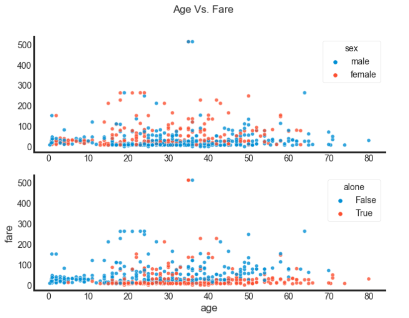
However, I want to go back to that fare disparity, and look into those who are alone and those that are men. We did want to find something out about those solo men travelling aboard after all.
Below I have a double scatter plot, I’ve despined it to make it a bit easier to see and set it on a white background, setting an alpha < 1 allows us to see points over each other more clearly.
fig, (ax0, ax1) = plt.subplots(nrows=2)

sns.scatterplot(x='age', y='fare', data=data, hue='sex', alpha=0.8, ax=ax0)
sns.scatterplot(x='age', y='fare', data=data, hue='alone', alpha=0.8, ax=ax1)

fig.suptitle('Age Vs. Fare')
sns.set_style('white')
sns.despine()
ax0.set(xlabel=None, ylabel=None)

plt.rcParams['figure.figsize'] = [9, 7]
plt.show()

Take note that the really high fares appear to be for men whilst the majority of the high fares belong to women, although few of those women appear to be alone. Although not all, as the data below shows.
data['lonely_men'] = np.where((data['sex'] == 'male') & data['alone'] == True, True, False)
data['lonely_women'] = np.where((data['sex'] == 'female') & data['alone'] == True, True, False)
print(data['lonely_men'].sum())
print(data['lonely_women'].sum())

Let’s now consider what else we can learn. What about an age distribution of these 411 lonely men according to cabin class. Any guesses before you have a look ?
fig, ax = plt.subplots()

ttc_mean = round(data['age'].mean(), 2)
ttc_median = round(data['age'].median(), 2)

sns.boxplot(x='age', y='class', data=data)
sns.set_style('dark')
ax.set_title('Age distribution for lonely men')
ax.axvline(x=ttc_mean, color='m', label='Overall Mean', linewidth=3, linestyle='--')
#ax.axvline(x=ttc_median, color='r', label='median', linewidth=2)
plt.rcParams['figure.figsize'] = [9, 7]
plt.legend()

plt.show()

It’s quite clear to see how as we go from ‘Third’ to ‘Second’ to ‘First’ the middle of the data gets older, although you can see that most have quite a wide range in them.
Finally, let’s compare two histograms, one of the lonely men, and one of the lonely women. Are they similar, what glaring differences do you see ?
In order, to write this, remember we need to have them both plotted on the same axis. As such they both need to have the argument ax=ax for it to work, as well as different colours for visual clarity.
fig, ax = plt.subplots()

sns.histplot(data[data['lonely_men']]['age'], ax=ax, alpha=0.6)

sns.histplot(data[data['lonely_women']]['age'], ax=ax, alpha=0.6, color='green')

plt.suptitle("Lonely Men Vs. Women Age Distribution")

plt.show()

So what do you think. What would you like to know after looking at this ?

